Understanding Kodular
The apps in Kodular are built as a combination of various Components , with each individual Component being used for a specific purpose.
The Component's behaviour is configured using Blocks
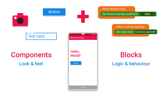
Components + Blocks = Your Awesome App!
What are Components ?
Components are the basic building elements of any app in Kodular. Everything in the app is done with the help of one component or the other.
Different components are used for different purposes. One component may be used to design the User Interface(UI) of the app, for example a Button component, while others may be used for performing actions like communicating to a database, saving an image to the Android device's folder etc. for example the FirebaseDB component.
What are Blocks ?
Blocks are ones which are used describe how to do a task. The way in which the Components respond to various actions and events in the app is designed using the Blocks.
For example, how the app should respond when a Button is clicked, what data is to be communicated to the database using FirebaseDB component etc. are all configured using the Blocks.
Thus, by using the various Components and by configuring its behaviour and response to actions from the user with the help of Blocks, an app is "koded" in Kodular.
The Car Analogy
Let us consider an analogy of a Car to better understand the concept of the components and blocks.
A Car is constructed using various parts, like wheels, doors, engine, steering etc. each performing its own unique function.
Some of these parts are visible to the driver(who is the user of the car) and he interacts with them directly, while some of them are not visible. And these parts know what their function is and how to perform it, for example, the function of the wheel is to provide support and move the car, the function of the steering wheel is to help streer the car and so on.
An Android app is like the Car. Like how a car has various parts, an app is constructed using various Components, like Button, Label, File etc. with each component being used for a particular purpose.
Like the parts of the Car, some of these Components are visible to the user of the app and they interact with it, while some of the components don't interact directly with the user. The behaviour or the purpose of these components are configured using the Blocks. The "how to perform the function of a component" part is configured by using the Blocks .
Types of Components
-
Visible Components: The components that can be viewed in the Viewer panel of the Designer page are known as Visible Component. They are visible to the user in the app and the user can interact with it directly and help in building the User Interface of the app.
-
Non-Visible Components: The components that are not viewed in the Viewer panel of the Designer page are known as Non-Visible Component. They are the components that usually do other things like saving a file to the device's storage, getting data from various sensors of the device etc. But, sometimes, these components may also be used to create visible elements in the app. For example, the Notifier component, which is a Non-visible Component can be used to create a dialog which is visible on the device's screen.
Types of Blocks of components
Each Component has its own set of blocks, divided into three types:
Property Blocks
Each component comes with its own set of Properties, which describe its characteristics. For example, the Button component has properties like Background Color, Text Color, Text Font Size etc. which are characteristics that describe the features of that particular button.
Some these Properties can either be set from Designer page, or through Blocks, while some can be set only through Blocks and some only from the Designer.
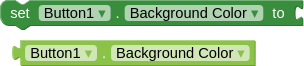
The Setter and Getter block for the Background Color property of a button.
At any time in the app, the given property of a component can be read through a Getter Block. It gives the current value of that property of that particular component.
Similarly, the given property of a component can be modified during the runtime of the app thorugh Setter Blocks.
The Property blocks are Green in color.
Info
Not all the properties of the component have both Getter and Setter Blocks. Some of them may have only Getter or sometimes only Setter blocks.
Method Blocks
Methods are certain functions that a component can do. For example, the Sound component should be able to play the music when required. This is done by using a Method called Play, which instructs the components to carry out the task of playing the music.
So, Methods are nothing but an instruction to carry out a particular task, like playing the music.
Some methods require some additional data, which will also be used in carrying out that task. For example, Firebase DB component stores the data using a method called Store Value. But how will the component know what data to store and under what name ? This is where Parameters or simply Params are used.
The Store Value methods has takes two parameters(i.e it makes use of two different data that need to be specified) namely tag and value To Store. So this method can be called(i.e used in the blocks) along with the two data that it needs like shown below.
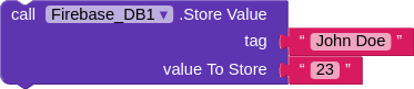
The Method to store data in the Firebase DB.
Event Blocks
Kodular apps are "koded" in an event-driven approach. That is, the blocks or behaviour of the app is executed based on the various events that occur. There is a wide range of events that occur thorughout the time for which the app is running, and the response of the app to these events can be configured.
For example, the user clicking a Button, the app starting are all events. The response of the app to such events are configured by grouping the desired behaviour under the Event block. The methods and property blocks grouped under each event are executed whenever that particular event occurs.
Let us take an example.
If you want to change the Button text when the user clicks it, you have to
group the logic to change the text under the Button.Clicked event. This is shown below.
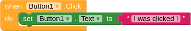
The Event block for changing button text when clicked.
If you have any queries or doubts, feel free to ask about it on the community